Improving our internal tools - Part I: Design process for Flexi UI
Change is the trigger & tool to put us ahead of the present and open a better, more productive, and more efficient future.

At Future, we are focused on creating and distributing trusted, specialist content to build engaged and valuable global communities. That is why we, the Tech & Eng department, understand the need to develop the right tools that help our colleagues successfully achieve Future's goals and deliver the best possible platforms to colleagues, and correspondingly, the best possible content to our audiences.
Future has been delivering content for decades. Many tools have been developed during this time, and inevitably, technologies, standards, and objectives have changed, creating uncertainty and making difficult the maintainability and scalability of our tools. However, this uncertainty leads us to think about new exciting changes that will solve more and more problems and give us light to decide on a plan to action new projects that improve what is suddenly not working anymore.
Currently, some of our tools have grown so much or have changed their initial purpose that it is necessary to reevaluate them, check why they are not working as intended anymore, and improve based on the gathered knowledge. Changing and updating our stack will put us ahead of the present and open a better, more productive, and more efficient future.
In this blog, we will be discussing the initial engineering process to improve our internal tool, Flexi UI. The aim of Flexi UI is to provide a centralised internal tool to be used by various stakeholders to ease and be efficient when creating new Magazines/Sites. The initial reception of the tool was good, and it proved valuable for the business. However, as time passed, we realised it was falling short in terms of UX, and the technical side of it was in desperate need of improvement.
After listening to many pain points from our developers, we understood that the solution wasn't to add more features; the solution was to redo the UI to the latest standards and based on design theories and feedback provided by real users. In this way, performance, efficiency, developer experience, and user experience would be boosted.

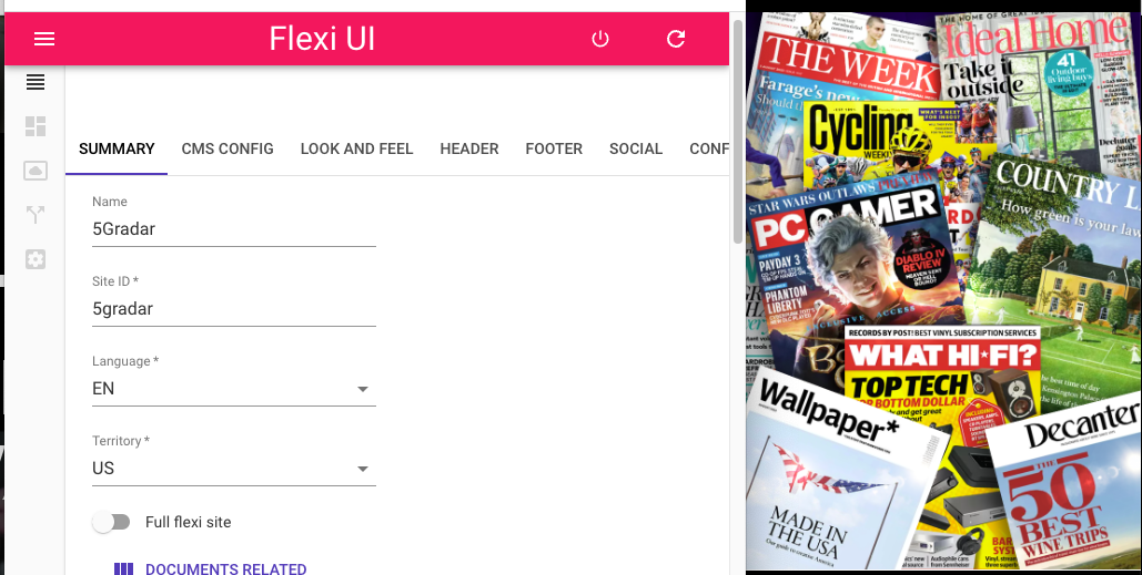
Flexi UI - Current version
Our process
During many meetings, we started hearing that people were struggling to use Flexi UI. That's why we set up sessions and a plan to address this situation. This was our initial process:
1. Listen: We organised brainstorming sessions with different stakeholders and gathered all positive and negative information about their experience with the app. The groups were small, with a maximum of 4-6 people, involving individuals with different levels of expertise and roles in the company. The only rule for selecting participants was that they had to have used the app at some point. The brainstorming sessions allowed everyone to talk in a safe space, ensuring that no member influenced the other.
2. Create a proposal: For this step, we created an inventory of the current features of the UI and a sitemap to possibly improve user journeys. With this information, along with what we had already gathered, we created wireframes. For this task, we used Figma as it is a very complete tool and it helps us to share fast in real time & gather comments on the design. These were constantly shown to tech leaders and stakeholders to verify and validate if we were heading in the right direction toward a solution.
3. Pitch the idea to leadership: Once there was a solid proposal for this change, we called a meeting to pitch the proposed solution to leadership. We discussed the main goals, feedback, pain points, information architecture, wireframe, and an initial technical proposal to provide food for thought about the overall effort required.
4. Flesh out the idea: With new feedback and more ideas from the business point of view, we iterated again on the designs and proposal. We started creating a low-fidelity view of the journeys, always thinking of solutions that could reuse patterns from other internal tools to reduce training times and improve internal UX in an innovative way. We maintained a mindset of sharing fast and improving ideas fast.
We continuously had "tell & show sessions" with the stakeholders where we gathered feedback and changed direction when needed, at the right time.
5. Create a plan: After the low-fidelity designs were approved, we decided on what would be the first journey to develop and started to create a plan. This included full journeys, technical plans, product discussions, infrastructure, timescales, the team that would be involved in the development of the new app, among others.
6. Final journeys: In the first instance, we finalised the designs to high-fidelity, ready for a developer to take them and transform them into a usable UI. These journeys were so variable as more features were developed during the discussions and design, so the iterations on the design had to take this into account constantly, especially for the final journey.

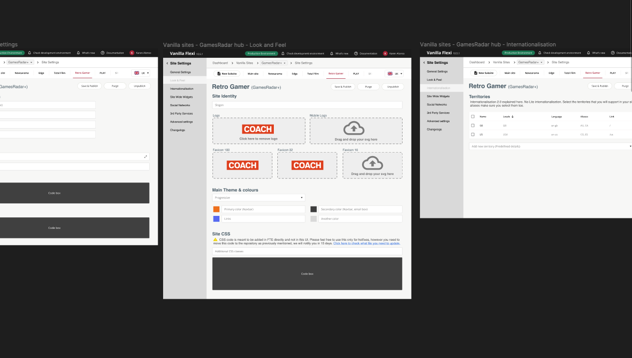
Flexi UI - final functional design
7. Technical discussions & development: This is a story for another blog. Watch this space for more about our thinking & engineering process to develop internal tools.
